


Choosing colour is one of the trickier parts of the illustration process. I still find it challenging because the process involves exploring the colours that don’t work well together in order to find the ones that do. It can feel so gross…and so cringe. It’s a messy path! Once you accept the process and understand the principles it will allow you to move through the cringe phase and into the holy shit this is gorgeous phase and your illustrations will improve dramatically.
Let’s dive in!
Choosing your own colours
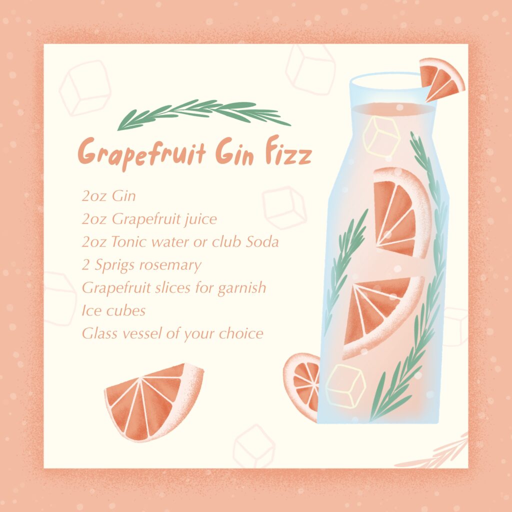
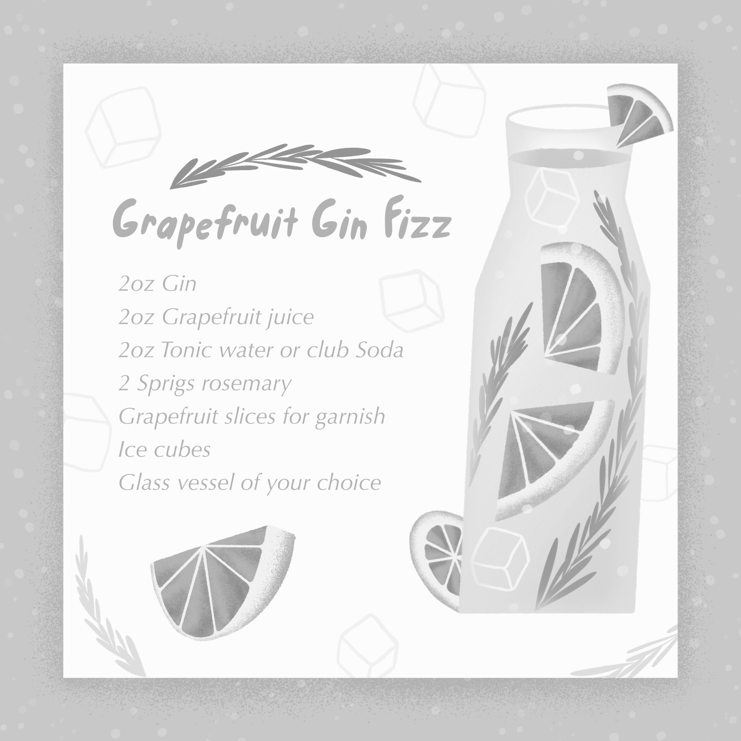
I’m going to take you through this grapefruit gin fizz illustration I created for the Cocktails & Mocktails illustration challenge. You’ll learn what my process was, how I chose a custom harmonious colour palette, and tips that you can use for your own projects.
Before you start, ask yourself this:
1. What feeling do you want to viewer to get?
I wanted the colour palette of my grapefruit gin fizz to reflect the time of year – warm summer days on the patio, so that was my starting point. A warm soft colour palette.
2. Do you want life-realistic colours or stylized un-realistic colours?
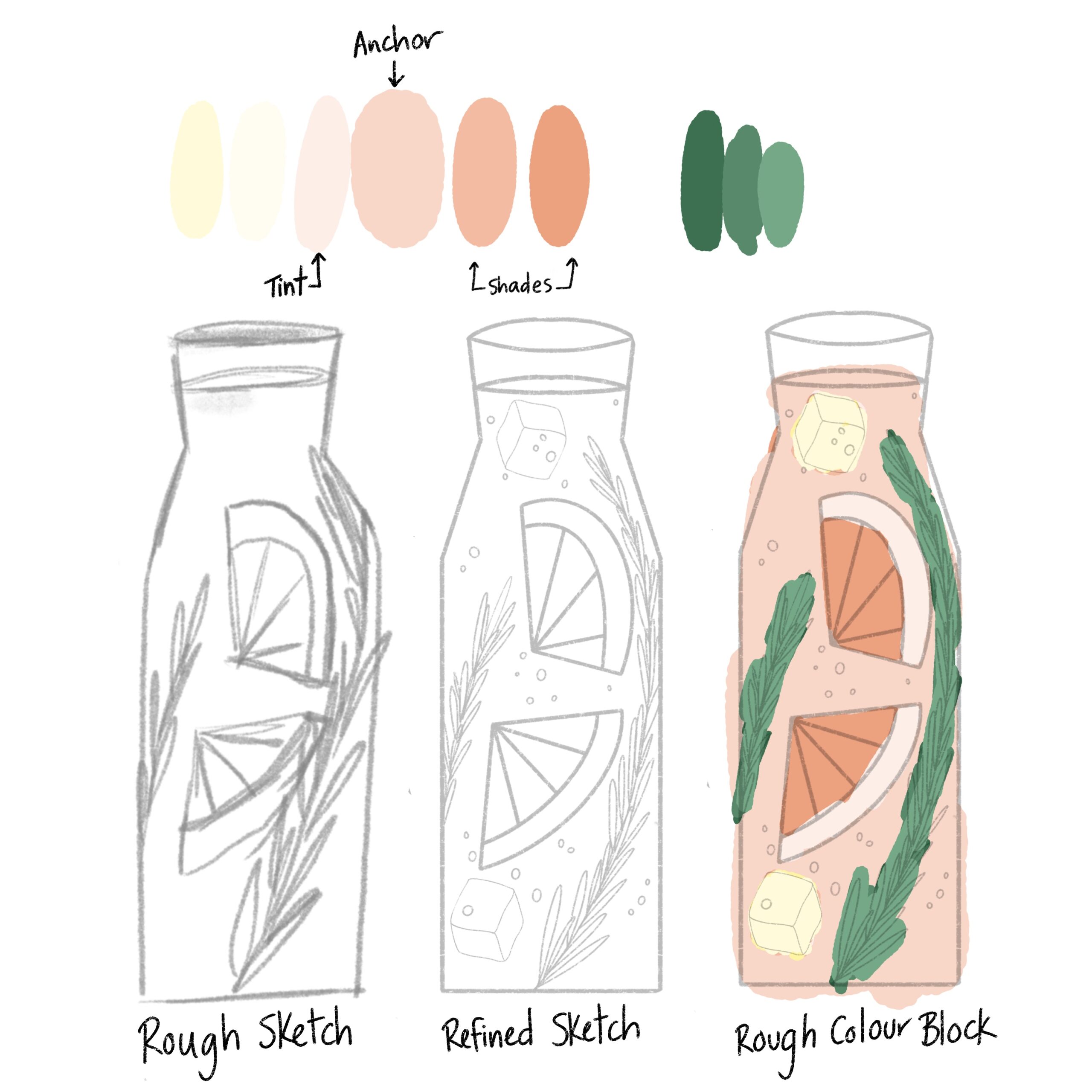
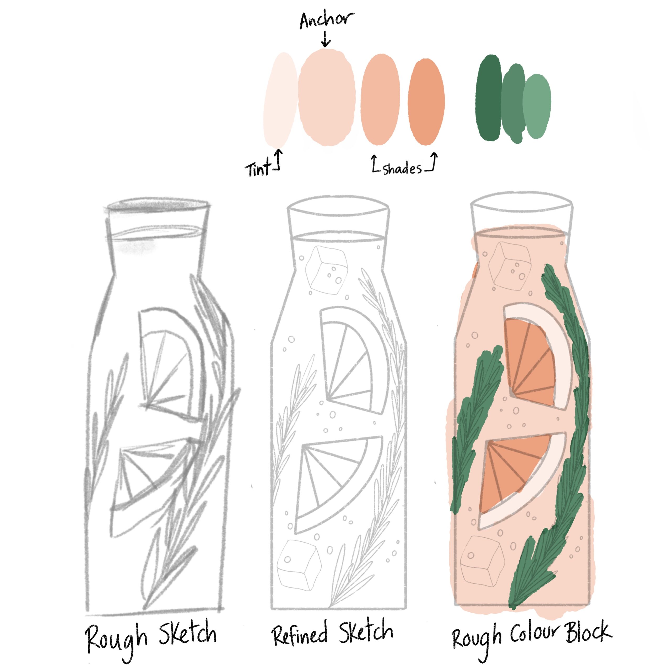
Because my illustration had grapefruit in it, I thought a more realistic colour palette would help communicate the citrus was a grapefruit and not a lime or lemon or orange. That warm peachy orange colour became the anchor colour of the piece.
I chose tints and shades from the anchor grapefruit colour that I knew would work well for the liquid and citrus slices
Colour Blocking
I like to start off by setting the fine sketch to Multiply and reduce the opacity to around 20%. Then you can start testing colours by rough colour blocking on a new layer underneath the fine sketch (this gives the sketch a transparency that allows me to see the sketch while I am applying colour).
Primary Anchor Colours
I like to choose an anchor colour that will have a large impact on the piece. For this illustration it was the grapefruit colour.
If you aren’t sure where to start and are daunted picking your own colours, try one of these sites: Coolors or Adobe Colour.
Tint = lighter (decreased saturation, or add more white, or both)
Shade = darker (can be done by adding more black, or saturation, or both)
Choosing tints and shades are particularly helpful for creating shadows and highlights in your illustration. Whether that is through a solid block of colour or through texture, the principle is the same. Tints and shades can also be achieved by using various blending modes (multiply = darker and transparent)(Screen = lighter and transparent).
They are also a nice way to start off choosing your colours as they are relatively easy and confidence inspiring 🙂
Secondary Colours
The second colour I knew I wanted in this illustration was some sort of Dark Green for the Rosemary garnish, so I intuitively picked muted greens and blocking those colours in.
Initially I chose something too dark – my eye kept getting drawn to the rosemary instead of the grapefruit, so I lightened the green up a bit to decrease the contrast.

Using the harmonious colour palette tool inside Procreate
Once I chose an anchor colour and intuitively chose the green, I used the Harmony tool inside of Procreate to come up with the light yellow colour to add to this warm colour palette.
- Open the colour palette
- Choose Harmony (disc, classic, harmony, values, palettes)
- Colour pick the anchor colour
- Tap the word under Colours (complementary, split complementary, analogous, triadic, tetradic)
- Choose analogous (this will select colours close to your anchor colours)
- Test it out!
*Canva has a great article on what analogous, complimentary etc mean and how it shows up on the colour wheel.
I wish I could tell you that I block everything out and then texture the colour blocks…but the truth is its a bit of a back and forth process for me as the texture influences the colour and vice versa. There is some wiggle room in there to adjust the colour palette as you go – but prioritizing the larger pieces of the puzzle is key to not getting bogged down in the details.
Adding more colour & harmony to the palette
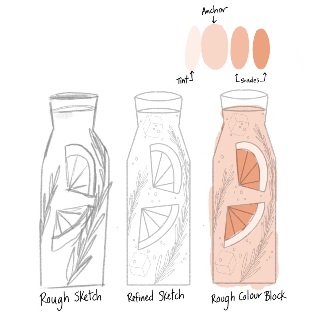
I knew I wanted one more colour for the glass. Usually I’d choose white but I already had a light background so I wasn’t sure what colour would work. So, I went back to the harmony tool inside of Procreate and found this light blue colour that completed the peachy orange colour
- Open up the colour panel
- Colour pick your anchor colour
- Tap on the upper left hand corner of the colour palette and choose Complimentary (or whatever you like)
- Tap on a colour to test it out.
Orange and blue are complimentary colours on the colour wheel, which is why those two colours work well together in the illustration! I just needed a tool to help get me there, and having this right inside procreate is ?
Checking the colour value
Colour value is the light or darkness of a colour. It allows us to see the contrast in a piece, and contract (similar to concept) is king. This can be a whole other blog post/topic, but it’s worth chatting briefly about here.
If you’ve ever wondered why some colours just don’t feel right, chances are their colour values are too close. I highly recommend putting a black and white filter over the entire illustration to evaluate the colour value.
If I’m being totally honest with my B&W critique I would say the illustration could still use more contrast. Especially with the blue colour of the glass!! It works well in the illustration, yet it doesn’t show up at all in the black and white colour value check (whoops).
However, I liked the way the colour palette was kept soft as it is in line with what I was hoping to communicate.

The process of selecting your own colour palettes is a bit messy and cringe worthy, but once you understand that’s just the messy part and there is a gorgeous part coming soon you’ll be flying with confidence.
I hope this post was helpful! Let me know if the comments what you think or what other topics you’d love to learn about from me. I would love to hear from you!
+ show Comments
- Hide Comments
Add a Comment